LEGAL***
Quick, precise access to the right document when decisions can't wait
A SaaS legal database for subscribed lawyers, notaries and law firms. Objective: Give legal professionals fast access to the right document when time is short, wherever they are.
Role: End-to-end Product Designer (UX/UI).
Timeline: 6 weeks for the first release, 1 week for the second.
BUSINESS PROBLEM
The existing platform was desktop-only, which meant 0% mobile access for subscribed users.
Outside the office, searching the database was impossible.
In a courtroom corridor, on the way to a hearing, or in the middle of a client meeting,
the archive they were paying for was not accessible.
CHALLENGE
| The brief and the question behind it
The initial brief was to extend the desktop SaaS to mobile.
But before I needed to understand how legal professionals actually
use databases outside the office, and found that a full mobile replica would not address their primary need.
The question changed from "How do we bring the desktop product to mobile?" to
"What is the smallest mobile experience that solves their most important job to be done?"
That led to a deliberate pivot: an app focused on searching and consulting relevant legal documents.
SOLUTION
| A single-purpose app, built to search and read
The brief asked me to bring the desktop platform to mobile.
I designed something smaller and more useful based on identified user scenarios: an app for authenticated users,
focused on one flow: search with filters, read, share.
Three archives
Case Law for precedents, Legislation for regulatory references, and templates for Annotated Forms.
Contextual filters
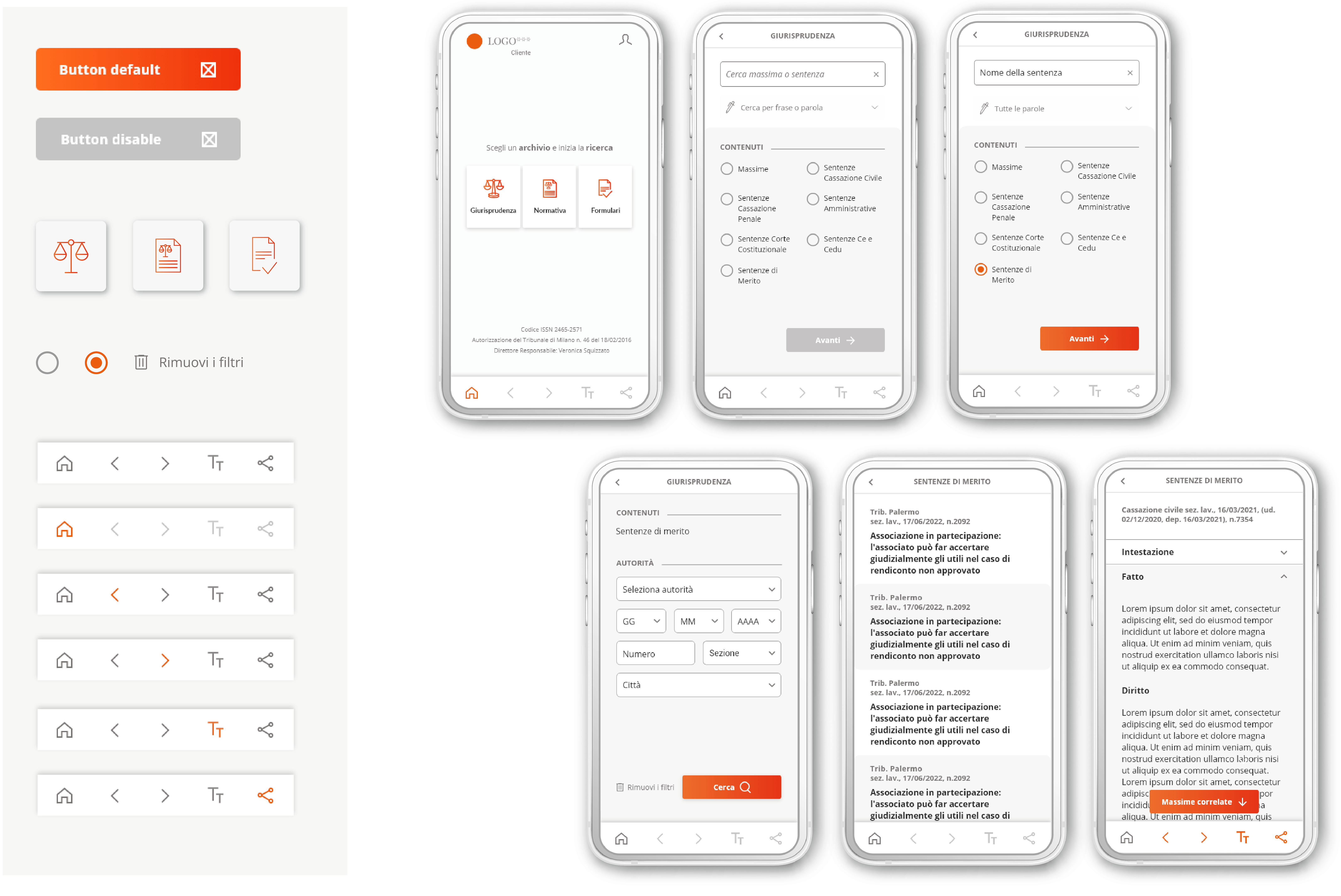
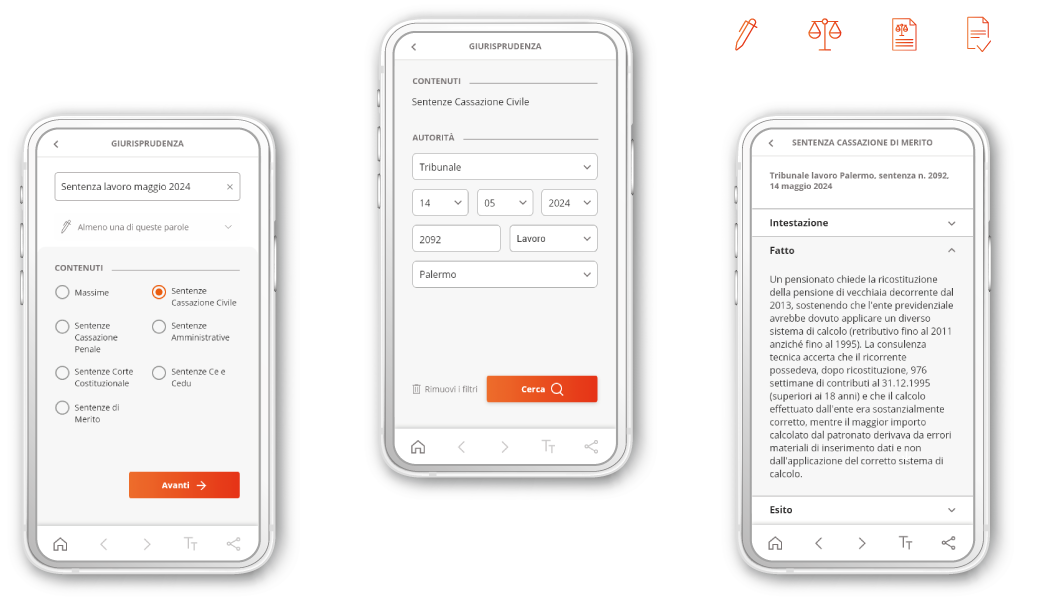
The app keeps the dynamic filters that lawyers already like on desktop, but makes them contextual.
Select the Court of Cassation, and the app shows only the sections and dates that apply, so users narrow a search in fewer attempts.
COMPETITIVE ANALYSIS
| Strong filtering capability, but limited queries and no mobile experience
I reviewed the existing product against a heuristic evaluation,
then analyzed 3 major competitors: generalist legal databases that work like text search engines.
I wanted to see how each one helps users define the perimeter of a search,
so I ran a feature inventory on archive categories, document types, simple and advanced search,
filter logic and document features.
Compared with competitors, the existing product offered:
- More selection criteria and dynamic filters.
- Fewer search combinations for keyword, exact phrase and exclusions.
- Lack of mobile experience.
USER RESEARCH
| What I discovered listening to the laywers
Research wasn't part of the brief. But I didn't want to design for an audience I might misunderstand,
so I ran my own: a questionnaire and interviews with 20 lawyers, reached through contacts and industry networks.
Some were subscribers of the client's platform, others used competitor products.
The answers shaped the project:
- 100% consult case law first, to find precedents similar to the case they are working on.
"I need concrete precedents similar to the case I'm working on" - 84% need to find relevant documents quickly.
"On mobile I want a clean interface, I'm not interested in news or secondary content" - 67% access legal information while actively working on a case. "In court or outside the office I need to run targeted, fast searches"
PERSONAS & USER FLOWS
| One builds a strategy, the other checks the ground rules
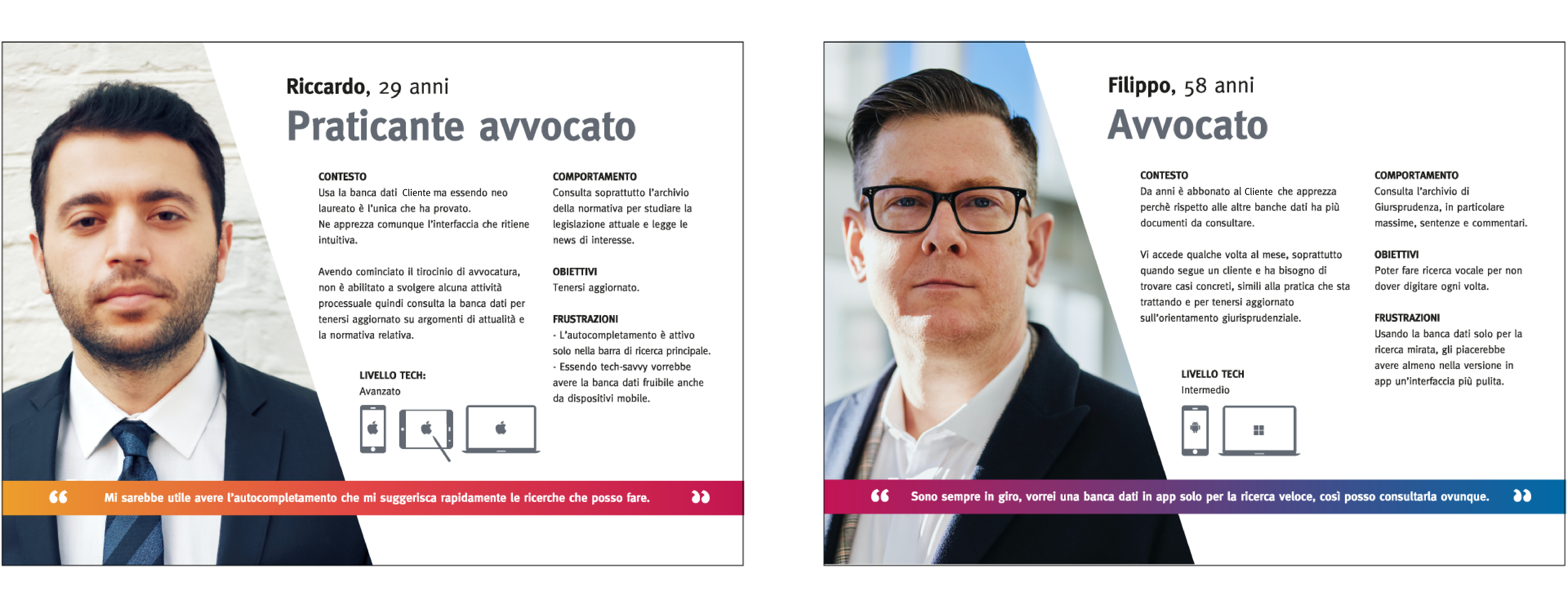
Two profiles came out of the research, each with a different way into the app:
- Filippo, Senior Attorney
Preparing a defense strategy, he searches case law for similar precedents to support his interpretation. - Riccardo, Junior Associate
Assigned a case file, he searches legislation to identify the applicable regulatory framework.
Both led to the same conclusion: the mobile product needed less functions.
KEY DESIGN DECISIONS
| Smaller experience on purpose
This is where the project changed direction.
The question in the brief was: how do we bring the desktop product to mobile?
The question the research suggested was different: what is the smallest mobile experience
that solves the most important job to be done?
A full replica would have copied features nobody needed on the move and hidden the one thing they did.
So I redefined the scope instead of reproducing the product and designed around one flow:
find the right document, refine the search, read it, share it.
INFORMATION ARCHITECTURE
Once the scope was clear, the structure had to be just as simple.
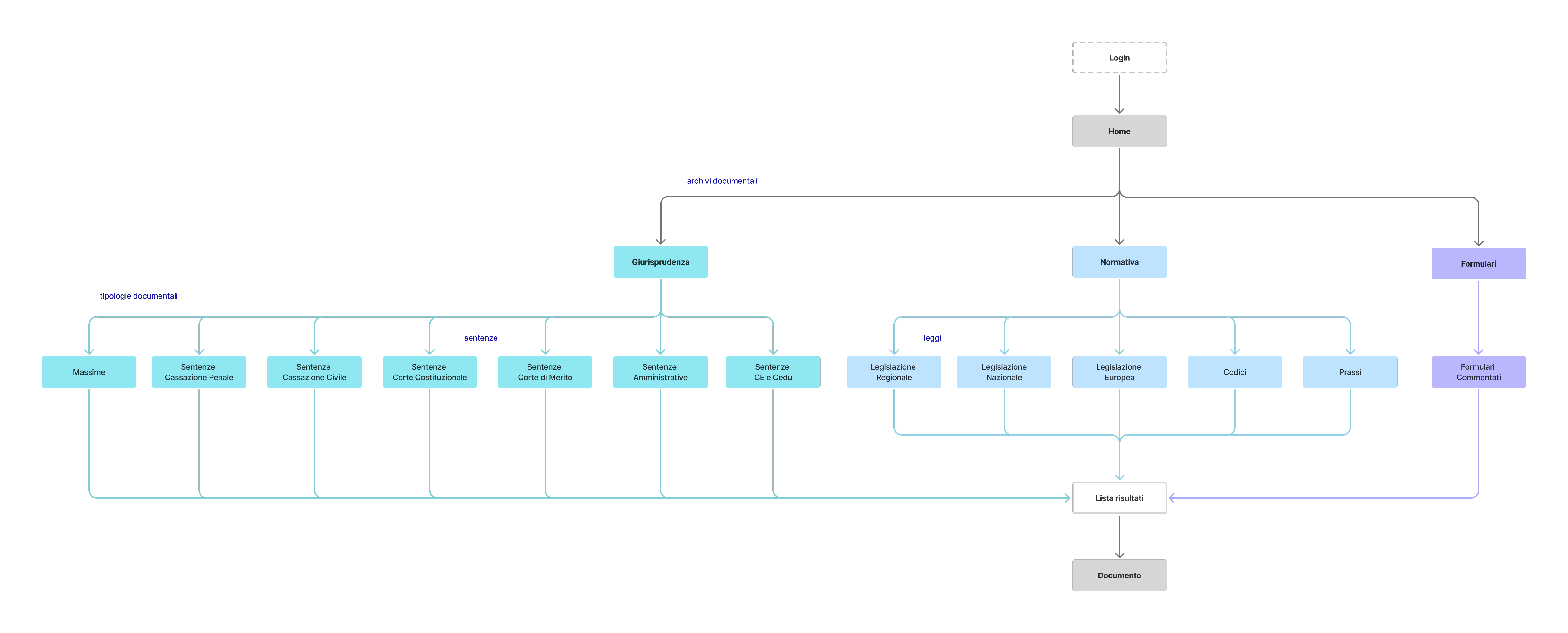
The hierarchy makes consultation easy across three archives:
- Case law - Maxims and Sentence
- Legislation - Laws, Codes and Practices
- Forms - Annotated templates
Archive → Search with filters → Results → Document.
WIREFRAMES
| Essential actions only when needed
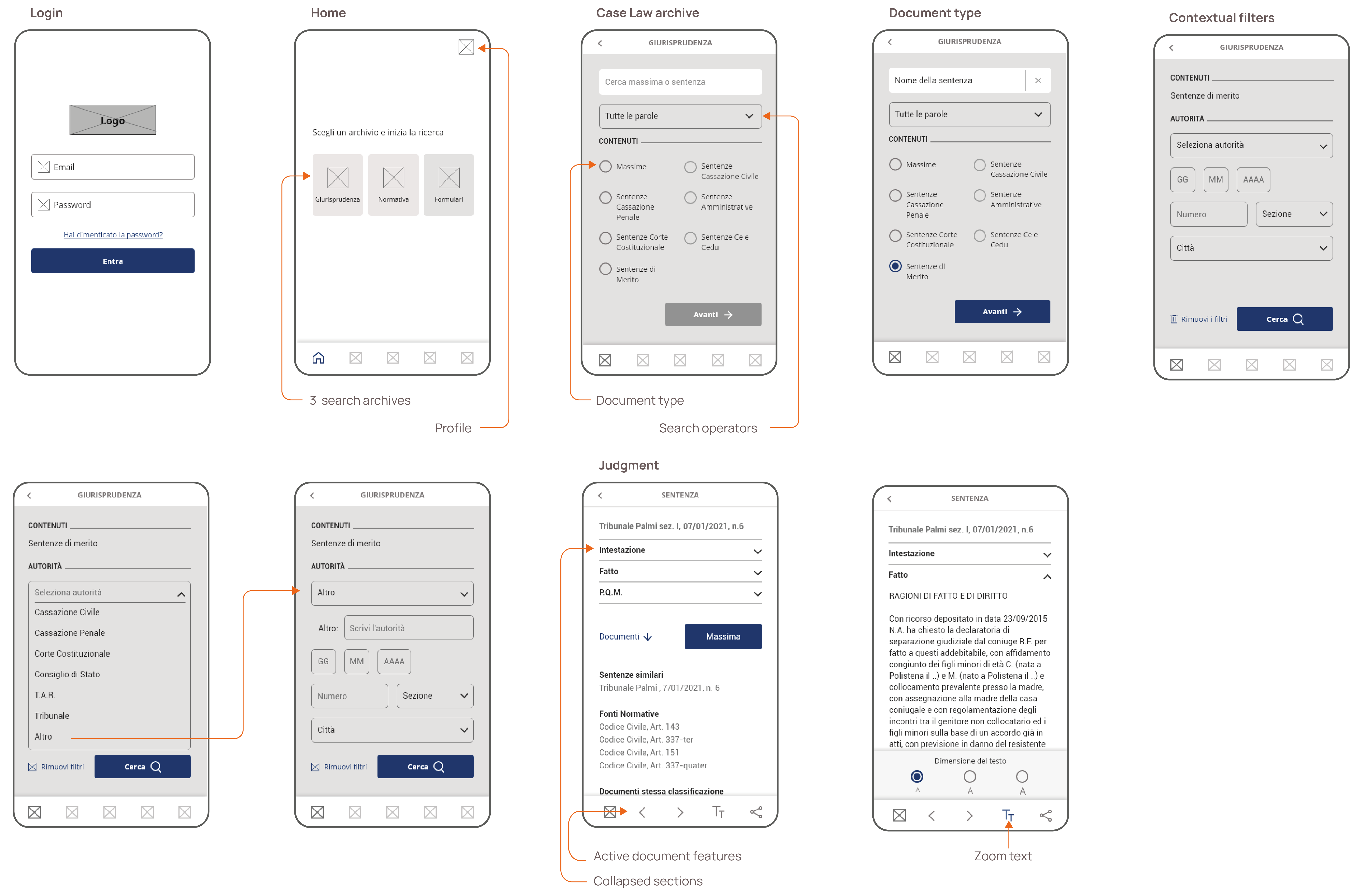
On a phone, every control competes with the text, so I moved the primary controls into a contextual app bar, which keeps reading space free and makes essential actions available only when a document is open: arrows to move between documents or articles, three text sizes that don't depend on system settings, and a share button for the current document.
UI AND DESIGN KIT
The app keeps the typography and colour palette of the desktop SaaS, so the brand stays consistent across devices and lawyers recognize the product as soon as they open it.