GIRLFRIEND | eCommerce
Girlfriend Collective is a lifestyle brand which produces sustainable activewear using recycled plastic material,
commited to create products that have a positive impact from a social and ecological point of view.
CHALLENGE
Since this is an assigned Case Study, it was requested to provide improvement of the user experience and user interface.
Role:I covered all the phases of the project,
from the Research to the Usability Test, until the final screens.
Duration: 5 weeks. In order to find out how I could have improved the user experience, first I needed to know:
- who is the BRAND
- who are the COMPETITORS
- who is the current and potential TARGET

DISCOVERING THE BRAND
Through an in-depth research I discovered WHO is the brand, WHY it was born,
WHAT are the values and its business goals.
Then I learnt about its production and dyeing process and all the materials/fabrics
used for its sportswear.

Sitemap and 10 Heuristics
To establish whether the website, in its desktop and mobile version, meets the usability and functionality requirements, I analyzed it according to the Nielsen's 10 heuristics and found for each one pros and cons. Overall the website is usable but the Usability attributes of Learnability, Efficiency, Memorability, Errors prevention and Satisfaction are not fully satisfied.


DISCOVERING THE OTHER BRANDS
The direct competitors are US brands that produce sustainable activewear and share the following main features:
- Entirely female audience
- E-commerce
- Top and Bottom active garments with plastic recycled materials
- Eco friendly dyeing processes
- Oeko-Tex certification
- Ethical and fair trade / work
- Join nonprofit organization
Since they are direct-to-consumer brands, I found appropriate to compare them through the "Feature Inventory" model.

DISCOVERING THE USERS
Accessibility: Actiwear for all shapes and sizes
The group of women shown on the brand channels is very diverse with all body shapes, ages and ethnicities.
The sizes ranges from 2XS to 6XL in leggings and from XS to 3XL in bras.
Female Community
The brand is committed to building a connection of people who care about the origin of clothing.
The main goal is to create a community of women who share its values: create products that have a positive social and ecological
impact.
Who is the aimed target?
Girlfriend Collective says it primarily targets Millennials aged 24-to-39 and Generation Z (under 23),
the latter considered digital natives.
What customers says?
Customers reviews in channels external to the brand and therefore not "influenced" are generally positive.
Survey & Research objectives
After analyzing the posts of users on Social Media and the reviews left in the Customer Service section on the website, I considered it appropriate to submit a questionnaire of 16 questions to a target of 54 women between 18-48 years old to understand their buying habits and use of activewear, in particular to understand:
- If from an ethical point of view the consumer is more sensitive to the social or environmental impact of the fashion industry
- Which feature she's looking for in an activewear product and what is the choice criterion
- In what contexts does she use the dress
- What would make a pair of leggings better and therefore more desirable
- What does she buy most often
- Where does she usually shop
- How much does she spend on a pair of leggings
- What is the preferred brand and why

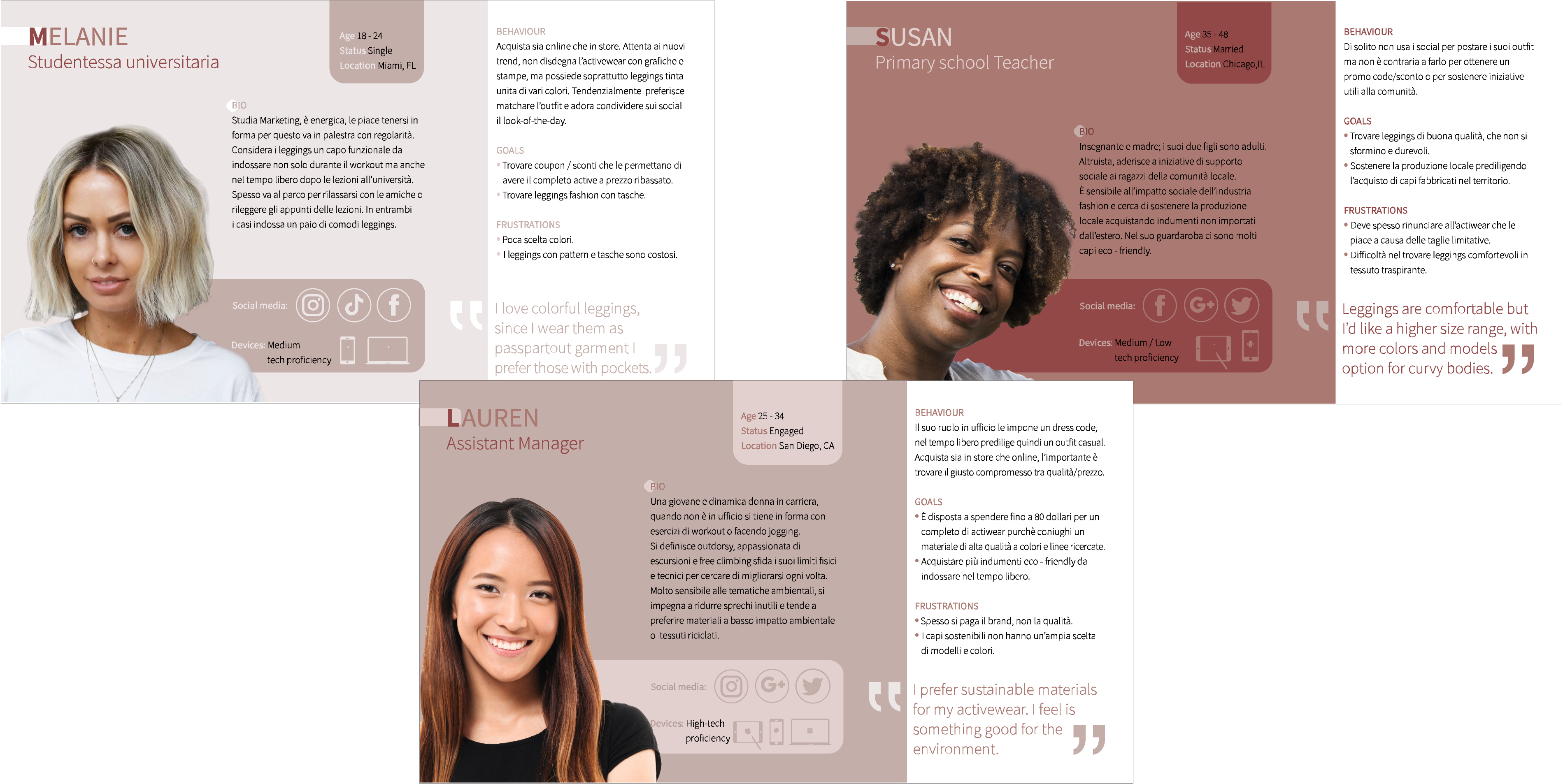
PERSONAS
The analysis of the data emerged from the questionnaire has enable me to understand in how many groups it is possible to divide the target and how they can interact with the website, so I defined 3 Personas.
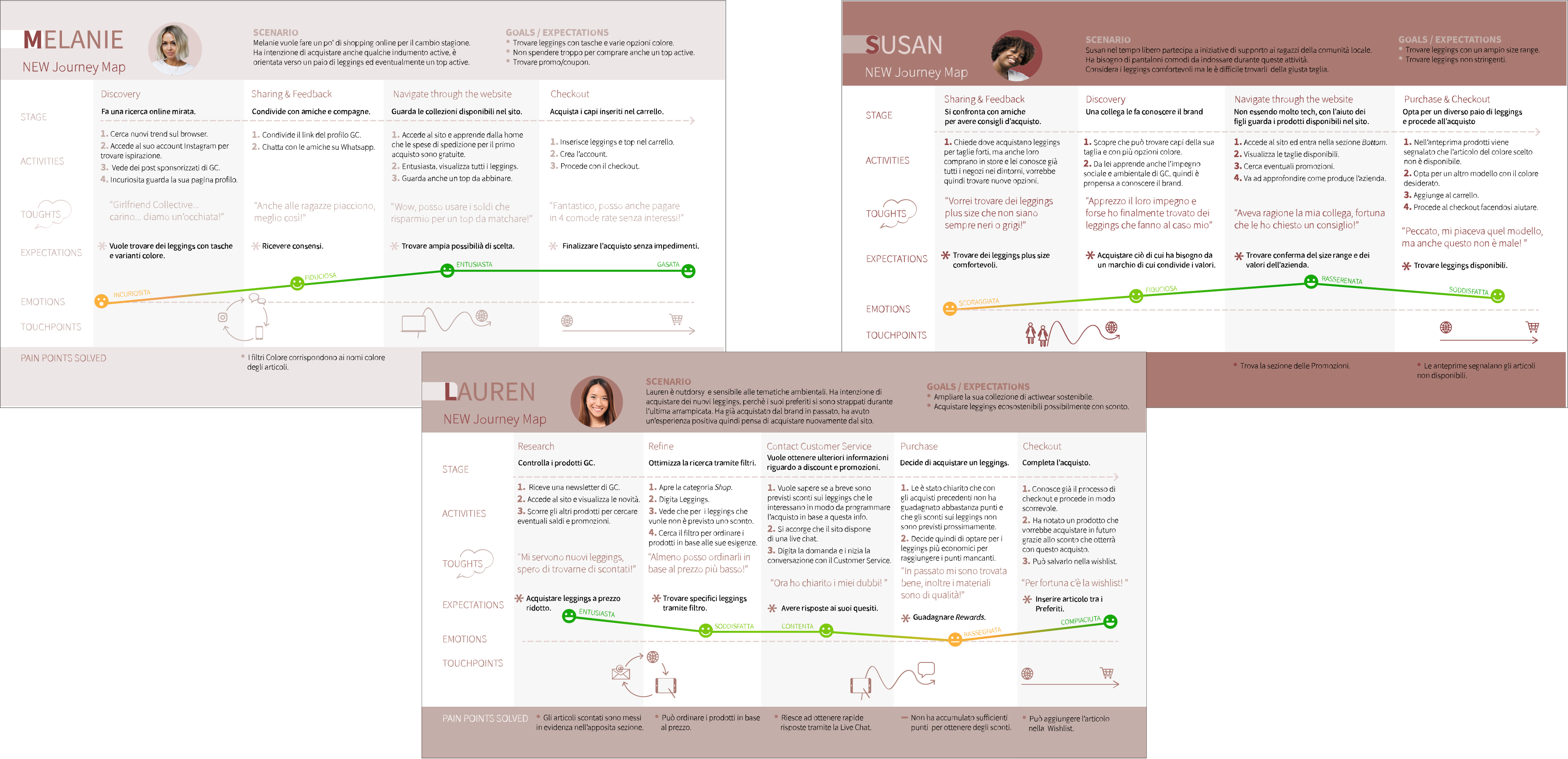
USER JOURNEY IMPROVED
I initially mapped a user journey on the website as is for each Persona.
The pain points surfaced from the
browsing experience have led to a second user jurney for each one with the opportunities for improvement emerged.
DEFINING THE PROBLEMS
to solve the right ones
The current main problems to solve in order to improve the overall user experience are:
- There is not a Discount page, but some products are for sale
- Bestseller page dedicated is missing
- Out of stock items are not reported in advance
- No Wishlist
- No Live Chat
USER FLOW
Every Persona has different needs, motivations and goals, therefore each of them may follow a different user flow.

IA & SITEMAP
The problems and pain points surfaced through the website analysis and user journeys have led to a modification of the original sitemap.

WIREFRAMING
(Sketching & Digital tool)
I made some sketches to set up the pages structure and the content hierarchy for the desktop and mobile version.
Later I developed hi-fi wireframes with a digital tool following the flow:
Product selection > Add to cart > Checkout,
by drawing the following pages:
- Homepage
- Category choice
- Category page (product previews)
- Product details
- Add to cart
- Checkout process (in 4 steps)


DESIGN SYSTEM
* The desktop version of the interface differs from the mobile version in some parts: components, button states, checkout process.
UI Palette
The monochromatic palette maintains the tonal range of the original website and recalls the shades of the skin.
All the foreground and background color combinations comply with WCAG AAA / WCAG AA accessibility standards.
Icons & Figures
All icons are conform to the target size,
instead the figures accompanying the website sections are not independent so they cannot be used independently.
Typeface
The prototype uses the "Roboto" as it is very similar to "Akzidenz-grotesk" font family used in the original website.
The dimensions of the texts are the recommended in Google Material Design.
PROTOTYPE | Desktop
PROTOTYPE | Mobile
TESTING WITH USERS
I set up 2 scripted tests with 2 tasks each to evaluate the usability
of the interface in the desktop and mobile version, taking into account
the user journeys and pain points emerged during the Discovery phase.
Both are unmoderated tests since it is a relatively easy to navigate e-commerce website.
DESKTOP INTERFACE TEST
1 test splitted in 2 tasks to simplify the flow and better identify any frictions:
- Choose a product and put it in the Bag.
- Finalize your purchase.
Established time for each one.
MOBILE INTERFACE TEST
1 test with 2 tasks in which the ease of access to specific information is tested.
METRICS
- 1° click
- Task duration
- Average time on screen
- Heatmap
TARGET
I tested both versions with 5 girls between 25 - 43 years old who reflect the Personas previously determined:
- used to online shopping;
- medium/high proficiency of devices.
GOALS
I felt that some flows could be less fluid/intuitive in the mobile and therefore needed to be examined.
The purpose of the tests was to assess whether the pain points have actually been resolved or reduced,
specifically to determine whether the target can easily:
- browse categories to quickly find a specific product model;
- complete the checkout process;
- find discounted items;
- communicate with Customer Service.
SCRIPTED TEST 1 Desktop Interface
Method
Closed-Direct task,unmoderate.
TASK SCENARIO A
"You want to buy a pair of legging and you are geared towards a specific model.
Navigate through the website and Add to Bag the following product:
- “Compressive high-rise legging _ Plum”
TASK SCENARIO B
"You have already insert some products in the
Bag and now you want to purchase them.
Go to Bag and complete the checkout by Login."
OUTCOMES
Testers were able to complete the task smoothly.
The error rate is very low, due to the colors used for product previews very similar to the one to choose (purple - lilac - plum).
This is a non-critical error which therefore did not affect the completion of the task,
but only delayed the efficiency in its completion.

SCRIPTED TEST 2 Mobile Interface
For the mobile interface, I set up a test to evaluate the Searchability of some information. I did not use a First click test because to find the information requested in the tasks it is necessary to make a path and therefore more taps.
Method
Open-ended task, unmoderate.
TASK SCENARIO A
"You have a limited budget so you want to purchase a product on sale.
Where would you go/tap to find any discount available in the website?"
PATH CHOOSEN A
4 out of 5 testers made the 1st tap on CTA Shop now and scrolled the homepage to discover the options.
1 tester clicked directly on the menu but closed it to return to the home and only after browsing
he tapped on Special price menu category.
GOALS A
Evaluate if some information is easily found, understand how the user behaves spontaneously
and how he interacts with the product.
OUTCOMES A
The task expected testers freely choosing a path to find discounted products.
They tapped on the Up to 50% off slide, a possible and correct path but that I did not expect.
Being highlighted in the homepage, the section made the testers choose that route, the fastest, instead
of going directly to the appropriate menu section.
TASK SCENARIO B
"You need to talk quickly with the Customer Service about a doubt you have regarding a product.
Where would you go / tap if you need to reach
out quickly the Customer Service?"
PATH CHOOSEN B
4 out of 5 testers tried to open the navbar.
3 then chose Help & Contact and 1 the Chat icon.
1 tester went directly to the footer and has
chosen the Help & Contact option.
GOAL B
To discover if testers find the Live Chat.
OUTCOMES B
The testers quickly found the way to contact Customer Service but only 1 resorted to Live Chat.
The icon is not immediately recognizable probably due to its positioning and / or color.
FEEDBACK B
Divide the Live Chat icon from the Newsletter section or replace the dots with the text "Live Chat".

