BALI YOGA | Yoga Centre
The company is a yoga center based in Milan that offers yoga classes with various styles and levels.
Services and advantages:
- Individual classes
- Professional training courses
- Corporate classes
- Workshop
- Free Trial Lesson
- 2 types of lessons: in studio and interactive
- 14 yoga styles
- 3 levels: basic, intermediate, advanced
- 25 teachers

Role: Since this is a Case Study I covered all the phases of the project,
from mapping out the problem to delivering the final design.
Duration: 5 weeks.
The problem is about the Individual Courses
- It is not clear that the company also offers individual courses.
Because they are not mentioned in the homepage where only the courses to become yoga professionals are advertised. - Furthermore the information about the individual courses is fragmented into various pages which prevent from having a clear overview, making the user start and interrupt many flows.
- The primary purpose of the company is unclear.
All the buttons are primary CTAs which do not guide the user to follow a intentional path.
What is the purpose of the project?
Since the company aims to online selling and booking, the goal is to improve the user experience on pages that allow
the user to join a individual course.
So the path from the request of a free trial, to the purchase of a package until the lesson booking on the calendar.
And why?
Make it clear that the company also offers individual courses and facilitate their joining by providing: clear information and easy-fast-intuitive purchase and booking paths, allows the company to reach a wider target than it can reach by selling training courses (to become yoga professionals) or corporate courses.
DISCOVERING THE BRAND
I started by running an overall heuristic evaluation to figure out the issues of the website.
I then generated the sitemap as is, followed by an analysis of
the flows and pages related to individual courses, which is the part on which the project focuses:
- The 2 "Booking a lesson" flows: for the new user (free trial lesson) and for the subscriber user
- "Buy a subscription" flow
- "Pricing" page
- "Registration" page during the checkout process


COMPETITIVE ANALYSIS
Bali Yoga is considered one of the best yoga centers in Milan by the press and people;
evidence is given by many ranking charts available online.
The direct competitors are 5 companies operating in Milan,
identified because they tend to appear in the same rankings as the best yoga centers in the city:
Spazio Garibaldi 77, Casa Yoga, City Zen, Rama Yoga and Nalu Yoga
Common elements:
- availability of streaming lessons
- training courses
- online booking
Differences:
- not all of them offer free trials
- some of them offer an extra service
Methods of Analysis
- FEATURES INVENTORY
The intent is not only to compare the functionality of competitors website but also the elements visible at the 1st level of the navbar and make a quick comparison.
PURPOSE: establish which categories and functions to give priority to and to identify how others brands organized the category groups. - TASK ANALYSIS
To understand how to design the purchase flow, I identified the user flows that the user makes in competitor websites to achieve its goal.
PURPOSE: understand every step the user takes and the critical decision points.
Results
BaliYoga checkout is fluid and requires a few clicks for the expert user, but the cards (@home, marghera 43, etc.) can be tricky for the inexpert user because during the checkout they risk distracting or confusing him or worse to get the user out of the process. All the examined companies use the Mindbody CRM so the flow is identical, what changes is just the name of the CTAs. Anyway the checkout allows the user to easily change the order (number of items / cancel / continue shopping).

Hypothesis to validate
I assume that the current structure of the individual courses may cause the user to leave the website because:
- Being the important information fragmented in various pages is not clear to understand how they work
- The request for a free trial takes more than 8 clicks
- The pricing page does not offer an overview of the types of packages available and requires excessive scrolling, especially from mobile
- The checkout process is tricky for the less experienced user.
USER RESEARCH
The company has got an audience of various age groups, approximately between 20 and 65 years old, who practice yoga to combat stress, keep fit in a healthy way, restore mind and spirit. The age target was defined based on the followers and posts published on the company Instagram profile.
I surveyed 70 people aged 18-60 who take or have taken fitness / yoga lessons at the gym in the past. With the collected data I then defined 4 Personas.

COLLECTED DATA
86% of users prefer to sign up for a class at the gym rather than online.
There may be a different behavior / motivation between buying a product or a service.
A person who usually purchases a product online may be reluctant about a service. So:
- Make the payment process more accessible (for example by adding other payment options)
- Make forms more intuitive.
For 43% the price is reason for choice.
The site offers a wide choice of packages compared to competitors.
Try to enhance them and make the page more usable especially in the mobile version (too much vertical scrolling).
Only 12% are bothered by too many buttons.
(Against my expectations.) Surely the "3 simple steps to free trial" are to be reviewed,
but probably the “Buy” and “Book” CTAs in the header could remain buttons.
Only 14% of participants said to pay attention to the visual part (for instance Video), compared to 71% who considered the in-depth description of the courses a priority. Categories could be better grouped (sitemap), make the texts of some sections more readable (some both desktop and mobile have 8pt) and differentiate the interactive elements from the static ones (a cons on the previous heuristic analysis).
The additional services that users would like (Cafe) are about the location not the website.
Possibly the customer who buy every new lessons package could be given 1 branded snack (1 purchase = 1 snack)
to offer when he shows up at the gym and mention it on the purchase page.
4 PERSONAS

14 OPPORTUNITIES
Surfaced by Analysis and User Journeys
- From the homepage are not immediately clear all the services offered. → Add a homepage section for each service, giving more emphasis to individual courses (possibility to reach a wider audience than training and company courses).
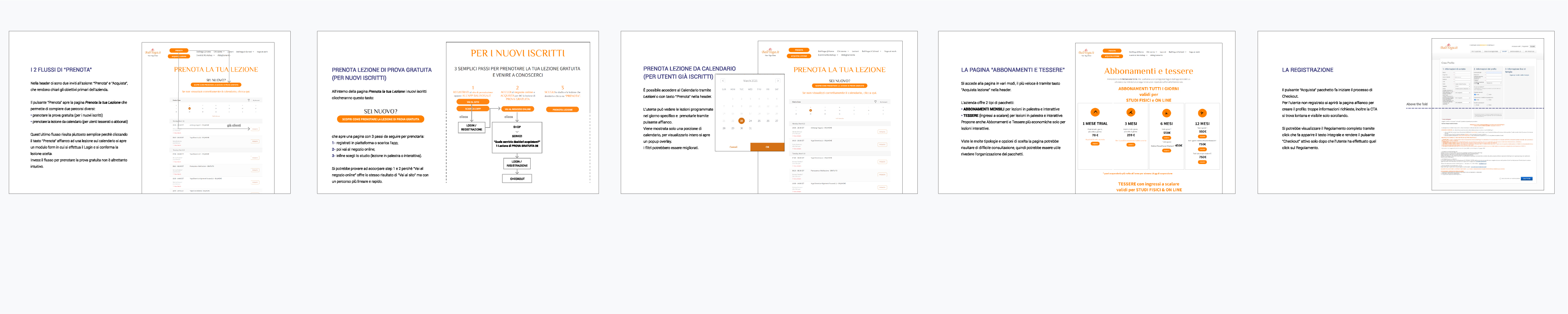
- "Book Trial Lesson" has too many buttons and the user flow is confusing and interrupted.→ Reduce clicks and make flow more linear.
- The "Calendar" could be improved. → Optimize the Calendar view and implement filters.
- The "Princing" page does not provide an immediate overview of all packages available. → Improve package organization to facilitate an overview at a glance.
- The "Lessons" page has many CTAs: links and buttons. → Determine which flow to prioritize and make other CTAs secondary or alternatively see to merge some pages.
- "@Home" has got 6 primary buttons. → Reduce the path "Book Trial Lesson" to 1 button and delete one of the two flows for "Buy" because they lead to the same result.
- The app download is inside a section. → Provide a link or icon in the footer as well.
- Where we are (it is called "Studios") is in Who We Are. → Optionally leave it as a sub-category in the menu, but give evidence in the footer via icon.
- "Yoga Styles" is inside Who We Are. → Group the pages more logically and consistently for the user.
- "Yoga Styles" has no CTAs. → Link it to "Calendar" or "Pricing" or alternatively turn it into a section of another page.
- "Checkout" has a different graphic interface. → Standardize the UI.
- "Checkout" has various clickable cards that risk interrupting the purchase process. → Delete the cards because they concern the scheduled lessons so it is more useful to leave them only in Calendar.
- "Registration" form is way too long. → Review the required fields and make the full Regulation available by click.
- "Payment Methods" offer few options. → Add fast payment and other options too.
These opportunities have led to a user journey improved for each Persona.
2nd USER JOURNEY
With the pain points resolved or improved
I initially mapped a user journey on the website as is for each persona.
The pain points surfaced from the
browsing experience have led to a second user jurney for each one with the opportunities for improvement emerged.

INFORMATION ARCHITECTURE
The new sitemap
Analysis and pain points in the user journeys have brought to a modification of the original sitemap.

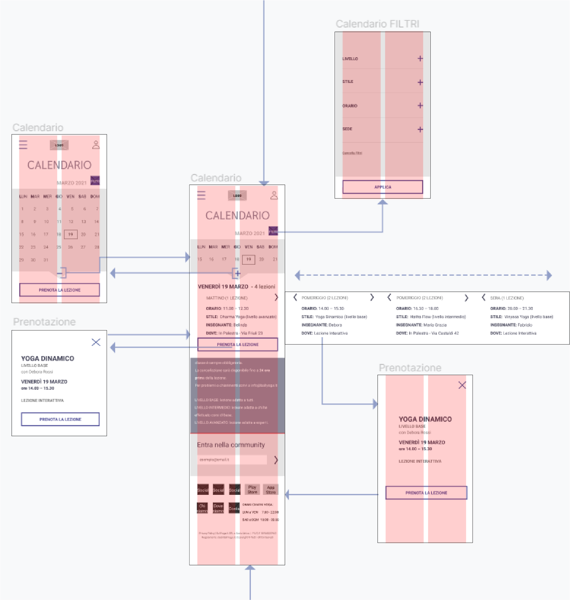
USER FLOW
Through the wireflow
I then developed the wireflow for each device (desktop, mobile, app)
DESKTOP & MOBILE
- Reservation of a free trial lesson
- Lesson booking on the calendar
- Filters improvement
- Purchase of a membership card
The same flows plus:
- Dark / Light mode
Followed by the clickable wireframes.

LOGO REDESIGN
I kept the flower of the original logo that becomes a lotus of 7 petals with a circle representing
the chakras at the top.
The "Thasadith - Bold" font takes up the elongated shapes of the petal:
The current logo is orange, a color widely used in the food environment; the new colors are the result
of a survey submitted to a group of users:
INDIGO - 6th Chakra (third eye chakra)
Symbol of spirituality and inner awakening; it represents the relationship with our inner capacities.
GREEN - 4th Chackra (heart chakra)
The color of harmony and nature: it symbolizes balance, peace and renewal.
UI KIT
The primary color is indigo, the secondary one is a lighter indigo / lilac. The buttons and some boxes have two opposite rounded edges to create a link with the logo shape.

PROTOTYPE | Desktop
PROTOTYPE | Mobile & App
USABILITY TEST
For this project I haven't run a real test, I just assumed to conduct 3 tests with various tasks on the main aspects of the interfaces
to determine the level of usability.
The testers would be the customers and/or followers of the brand,
contacted by email or post on its social channels with the following invitation:
"We are making changes to our website baliyoga.it to improve the services we offer,
to make browsing easier and the experience of people who use it more enjoyable.
To do this WE NEED YOUR HELP.
We would like to learn from your feedback or suggestions that will be valuable in improving our services.
For this reason we invite you to take part in a test that will last about 20 minutes in which we will ask you
to carry out some actions within the website.
We are going to test pages not people so don't hesitate!"
The user can choose whether to stop at the first test or complete all 3.
One of the following benefits would be offered to thank testers for their contribution and time spent:
- discount on a lesson package
- branded gadget (economy range)
- access to exclusive video content.
CRITERIA
- In-person, moderated
- Time assigned
- Target of 5 people (female and male) with medium/high devices proficiency (because online booking is always requested)
METRICS
- Task completion rate
- Time to completion
- First click
- Average time on page and number of clicks
- Error rate
TEST 1 Desktop, Mobile & App Interface
Method: Scripted, moderated test.
3 task scenarios that cover all the path the user need to join an individual yoga course.
TASK SCENARIO A
"You have never done yoga but you are interested in practicing it.
You have been recommended the Bali Yoga center which offers 1 free trial lesson.
You are on the homepage of the website and would like to request a free trial lesson.
Where would you click?"
GOAL A
Understanding if the user who interacts with the website for the first time immediately learns that he can get a free lesson.
TASK SCENARIO B
"You are willing to do yoga from home through online lessons, so you would like to buy a package just dedicated
to interactive classes.
You want to buy 5 Lessons to be made exclusively from home. Where would you go to purchase this package?"
GOALS B
It is possible to proceed in various ways, by:
- Button on the header
- Menu > Lessons
The aim is to understand if the splitting of gym / interactive lessons packages is clear enough and if the user quickly understands that some packages are mixed.
TASK SCENARIO C
"You already have a subscription to yoga courses and you just want to book
your next lesson on the website's Calendar, because you know that booking is mandatory for each lesson before taking it.
You would like to book the evening lesson on Friday, March 16th held by teacher Fabrizio. What page would you go on?"
GOALS C
It is possible to complete the task by:
- "Book" button in the header
- CTA on Lessons page
Understand if the booking flow is fluid.
TEST 2 Desktop & Mobile Interface
Method: 5 second test.
Lessons page is shown and the user is asked to memorize as many elements as possible within 5 seconds. When the time is up, some questions are asked.
QUESTIONS
- What is the service offered in the page you saw?
- What can you do through this page?
- What happens if you click the blue button?
- Does this page give you any information on interactive lessons?
GOALS
Find out if:
- UI communicates the message correctly
- Contents are immediately clear
- CTAs are perceived correctly
MOBILE INTERFACE

FINAL THOUGHTS
HOW MISTAKES DURING THE USER RESEARCH TAKE DESIGN IN OTHER DIRECTIONS
It was not possible to ask the target to navigate the current website, this constraint probably made the design solutions turn in another direction because I asked generic questions. Despite this, I got some useful inputs.
IS THE APP REALLY USEFUL?
Currently not because it does not offer added value.
It just allows the user to check purchases and book lessons.
In the redesign I added the login in the header of all the interfaces, so the user can check his activity from there.
Add an extra feature: to make the app more useful a "Calorie Counter" could be added,
so that the user can calculate how many calories he has burned per yoga session (minutes / level)
to increase his motivation and engagement with the company service.