NYU⋅ME | App
Naming concept: Nyu⋅Me (british pronunciation of New Me)
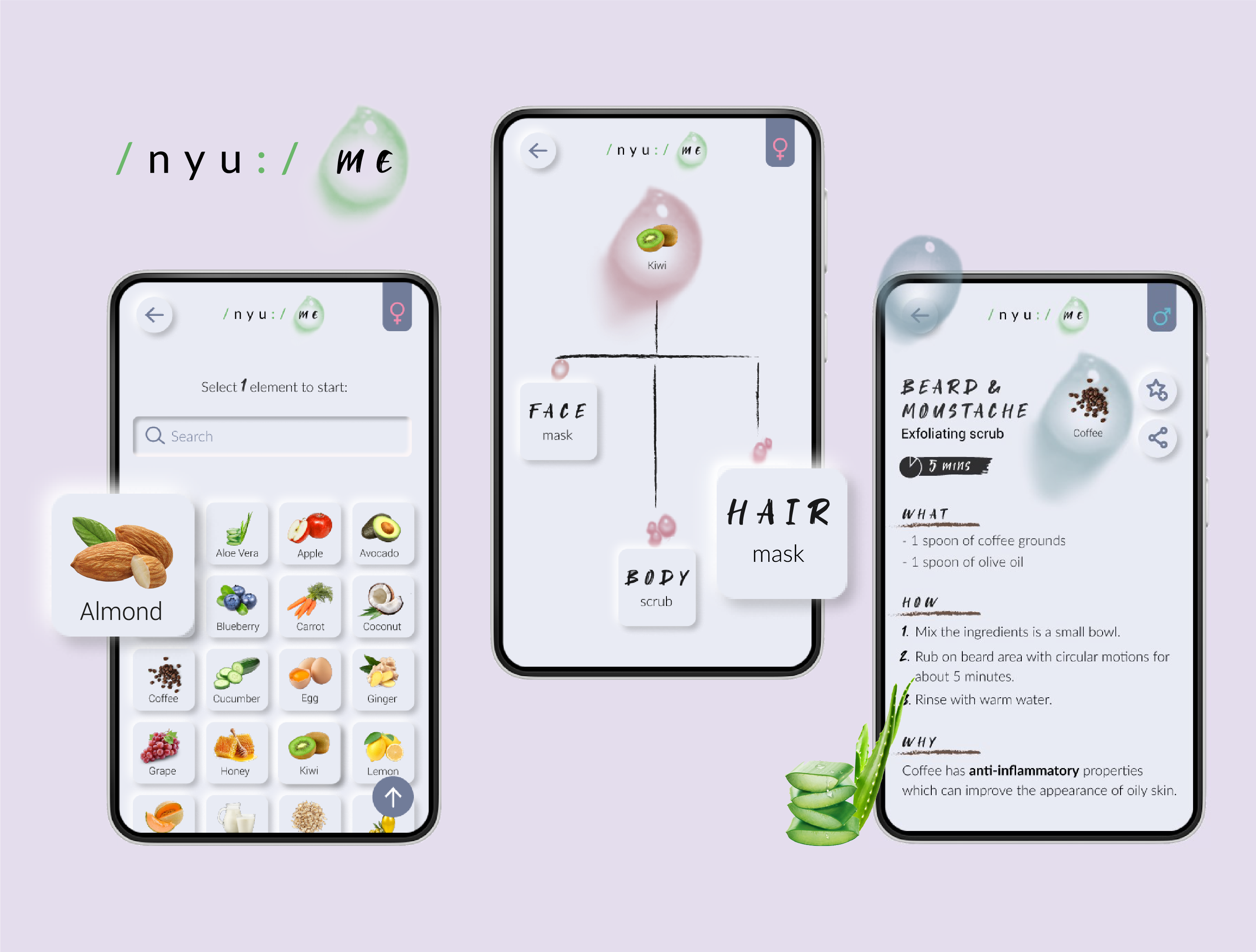
NyuMe is an App which offers a collection of simple remedies and recipes by using common natural ingredients, designed for people who like to rely on natural products for their beauty routine.
Role: This is my first UX and UI project, it is about a conceptual Case Study where I covered
all the phases, from defining the problem, to conduct the Usability Test and deliver the final product.
Duration: 7-8 weeks.
PROBLEM STATEMENT
On the Internet there are many sources in which to find tips and hacks for beauty care with natural products:
blogs, articles, YouTube videos or sections within websites related to natural lifestyle and wellness,
but there is not an esaustive source just dedicated to natural beauty remedies where to find all the possible
recipes from A to Zed based on natural ingredients.
I assumed that people are busy, so a person who likes to rely on organic products would prefer to do not
waste time and get information about natural skin/hair care remedies possibly from a single source to find all the
possible recipes.

COMPETITORS
WHO / WHAT is in the market?
To understand how the product would fit in the market, I started with a research of the main
direct and indirect competitors to find out the already existing alternatives in the market segment.
The major are represented by 3 apps:
DAILY BEAUTY CARE, BEAUTY CARE and BBEAUTIFUL.
Due to the features they offer, the audience they target and the catchment area they meet
(about +5.000 up to +500.000 download).
I profiled each one analysing:
- Key objectives
- Overall strategy
- Market advantage
- Market target
- Marketing strategies
- Pricing & cost
- Contents
Followed by an analysis of their SWOT profile.


USER RESEARCH
I ran a quantitative research surveying 93 people between 18 - 60 years old via SurveyMonkey, asking about their beauty routine, how much time they spend on it, which skin problem they care most. After analysing the collected data I created 3 Personas and the corresponding user journeys.

3 PERSONAS &
THEIR JOURNEYS


Flowmap
To define how content will be structured and presented to users when they are interacting with the design.

Lo-Fi WIREFRAMES
Through the Sketching technique I established the basic structure of the pages and the hierarchy of the content.
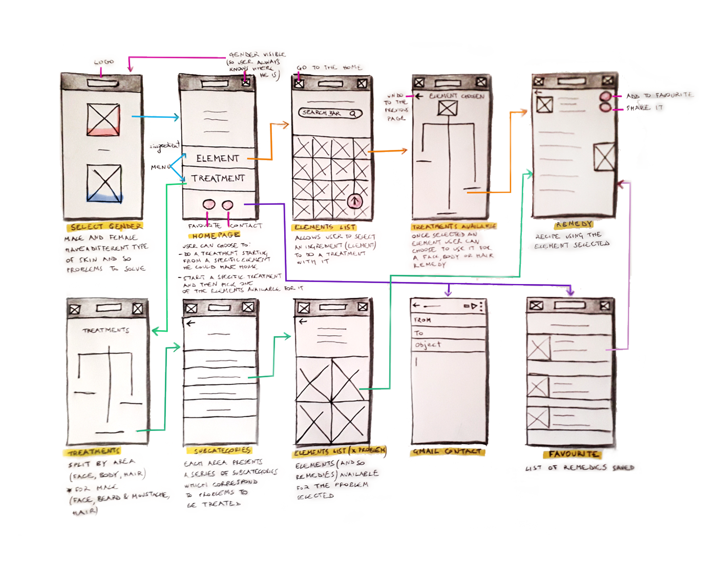
USER FLOW
The users interaction through the two available paths, choosing between:
- Element (ingredient)
- Treatment

USABILITY TEST
I conducted the test with 5 users
between 25 - 32 years old, with the Mid-Fi clickable wireframes, asking them to complete 3 tasks.
Method: In-person, unmoderated.
Type: Task Scenarios.
METRICS:
- Average time on every screen / action
- Heatmap
- First / last click
TASK SCENARIO 1
"You realize you bought too many lemons and if you don't use them they will expire soon.
So you decided to use them to make a hair mask.
Which path would you choose to see what you can do for your hair with some lemons?"

TASK SCENARIO 2
"You have just downloaded the app and you would like to do a mask for your dark circles.
Where would you go to find the remedy you are looking for?"

TASK SCENARIO 3
"You are a female and you have just done a treatment for you. Now you would like to see a treatment
to do on your male partner.
Where would you go within the app in order to see the remedies for male beard?"

The average timing completion was about 60 seconds per task.
Users have found the product very simple and easy to use.
Through their first and last click on each screen I was able to understand what was necessary to add in terms od UI, so
I went on with the development of the final screen.
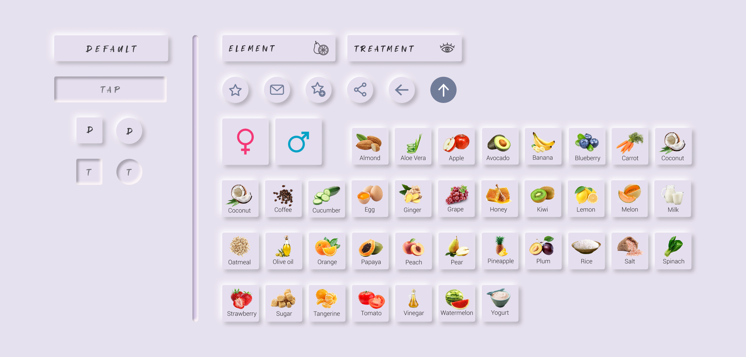
SOFT UI | Neumorphism
I chose to use Neumorphism because I wanted to make the colorful products (ingredients) stand out in a monochromatic environment (interface) and let the contrast and shadow levels typical of Soft UI show CTAs or interactive components.