BANK*** | Geolocator
A leading company in the financial sector, offering financial and asset planning and management products and services in the Italian market.
Objective: Enable users to find a financial advisor through an internal geolocation tool on the website.
Role in the agency: UX and UI designer. I covered all design phases defining the appropriate methodologies. The team also included a project manager and developers.
Duration: 2 months.

BENCHMARKING
13 Companies offering a geolocation tool on their website were analyzed.
3 types of competitors were identified:
- DIRECT COMPETITORS: Banks and companies that offer financial products/services in the Italian market, targeting the same audience as Zurich Bank.
- INDIRECT COMPETITORS: Companies that offer a different product but address the same need of the target audience.
- COMPARABLES: Companies that have faced a similar problem in different contexts, as successful solutions could be adapted to meet specific needs.

Analysis Methods
- FEATURES INVENTORY
On direct and indirect competitors to compare existing and missing functionalities.
- CTA AND NUMBER OF CLICKS TO REACH THE LOCATOR
On direct competitors, both desktop and mobile versions.
- TASK ANALYSIS TO FIND A FINANCIAL ADVISOR OR AGENCY WITHIN THE LOCATOR
On direct competitors.
- NUMBER OF CLICKS TO FIND A SPECIFIC ELEMENT (ADVISOR, AGENCY, RESELLER) IN THE LOCATOR
Across all three types of competitors.
- UI ELEMENTS
Across all three types of competitors.
Other Aspects Explored
- The Locator as a touchpoint for lead generation
- UX Best Practices in locator design
- Google Maps Best Practices
SOME FINDINGS FROM THE ANALYSIS
- Many competitors require more than 3 clicks to reach the geolocation tool (find a consultant).
- Only a few competitors have a full-width interactive map.
- Some competitors display the number of search results.
- In many competitors, the advisor profile cards do not support click-to-call functionality.
USER RESEARCH
The information gathered during the briefing phase
about the target audience helped define the characteristics of users to involve in the research.
Data to collect:
- Criteria for choosing a financial advisor
- Characteristics of the most frequently used geolocator
- Aspects of the geolocator that users would like to improve or change
- Devices most commonly used by users to consult a geolocator

Research method and selection parameters
A quantitative research type was conducted to collect statistical data and draw conclusions regarding users' general behavior. A questionnaire with initial screening and both multiple-choice and open-ended questions was distributed to a panel that met the following criteria:
- Country
- Age group
- Income range
- Trading method
- Types of financial products
The number required was 100, the questionnaire was completed by 120 respondents.
SOME COLLECTED DATA
36% of users rely on a specific competitor for wealth planning and management.
40% of users search for a financial advisor by asking their bank for information.
75% choose Google Maps even if the website they are browsing
has its own locator, and 90% use it as their regular geolocator.
90% believe the locator they use most frequently is the best because of its simple and easy-to-use interface.
88% of respondents consider it important to view photos of locations when searching for an address using a locator.
On the other hand, 55% believe the presence of a financial advisor's profile card is more important than their photo.
The most difficult aspect of using a locator, according to 37% of users, is the lack of filters they consider useful.
For 74%, the most challenging aspect of using the locator on mobile is the small screen size.
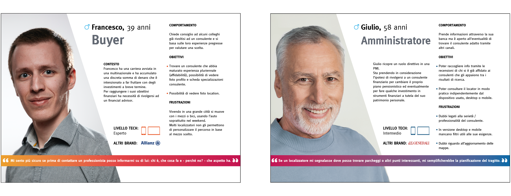
2 PERSONAS
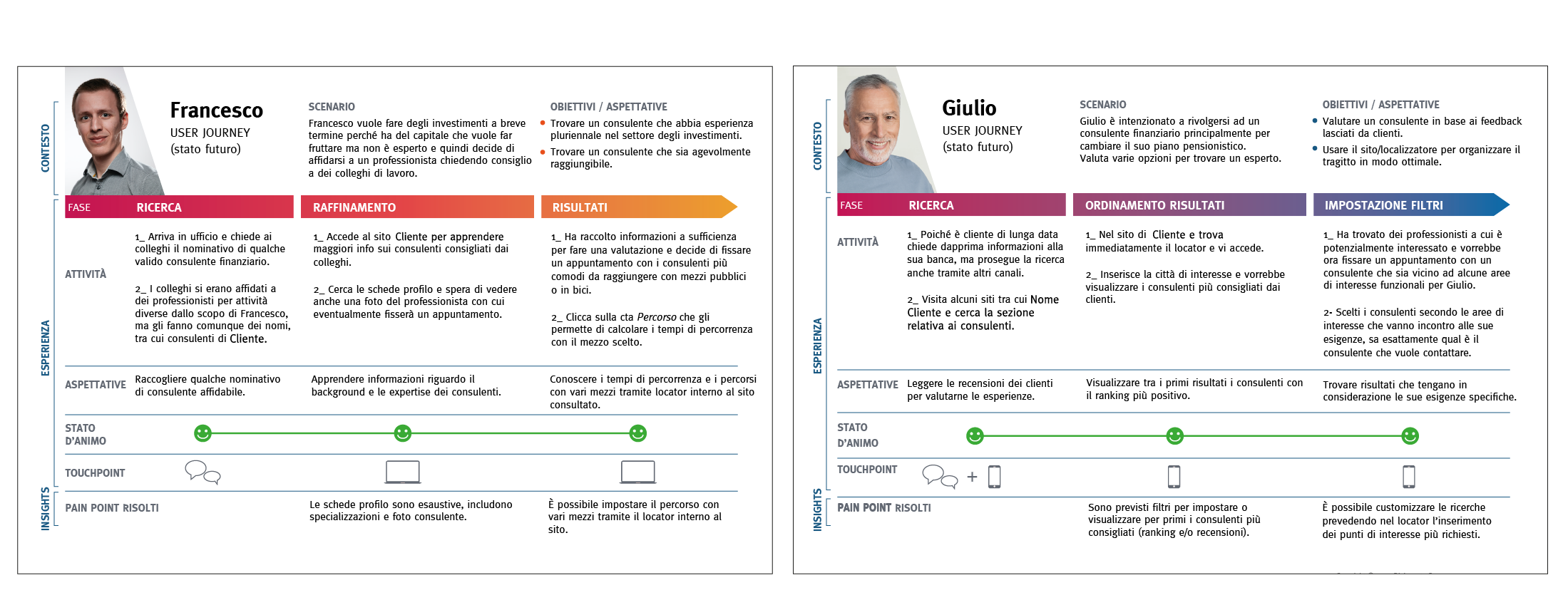
USER JOURNEY
Current state and future state
Each target group (Personas) is driven by different motivations and goals, resulting in at least one user journey for each. The first user journey was created based on the collected data, which uncovered areas for improvement. These insights led to the drawing of a second user journey, focused on enhancing the user experience within the locator.
USER FLOW
Desktop and mobile versions
Definition of the paths that Personas will take within the locator to achieve a specific goal.

WIREFRAMING
The design process was followed by the creation of interactive wireframes.

UI KIT
The client had an existing design system that was expanded with new UI components.

