LEGAL*** | Legal database
Legal information system that enables intelligent and targeted searches, guiding user in the quick and accurate selection of relevant information for developing their strategy.
Objective: Making the desktop-only legal database accessible
on mobile devices by designing an intuitive and user-friendly interface.
Updated bjective: UX research redefined the project goals → from a desktop SaaS platform
to a native app with key features for developing legal strategies on the go.
Role in the agency: UX e UI designer. I covered all design phases defining the appropriate methodologies. The team also included a project manager and developers.
Duration: 2 months.

COMPETITIVE ANALYSIS
The competitors are generalist legal databases that operate like a text-based search engine and use the same guided search structure.
The systems are analyzed using the Features Inventory method to compare existing and missing features and filters, with the aim of understanding how other databases assist user in defining the perimeter of his intended search.
Heuristic evaluation
To design the user experience for the app, it was first necessary to conduct a qualitative analysis based on Nielsen’s 10 principles to determine if the pages of the interface adhered to usability principles.

SOME DATA COLLECTED FROM THE ANALYSIS
- Compared to competitors, the client's system offers fewer search combinations for exact words / phrases / exclusions.
- The advanced search in the client's system offers more selection criteria and includes dynamic filters.
USER RESEARCH
"How should your online legal database be?"
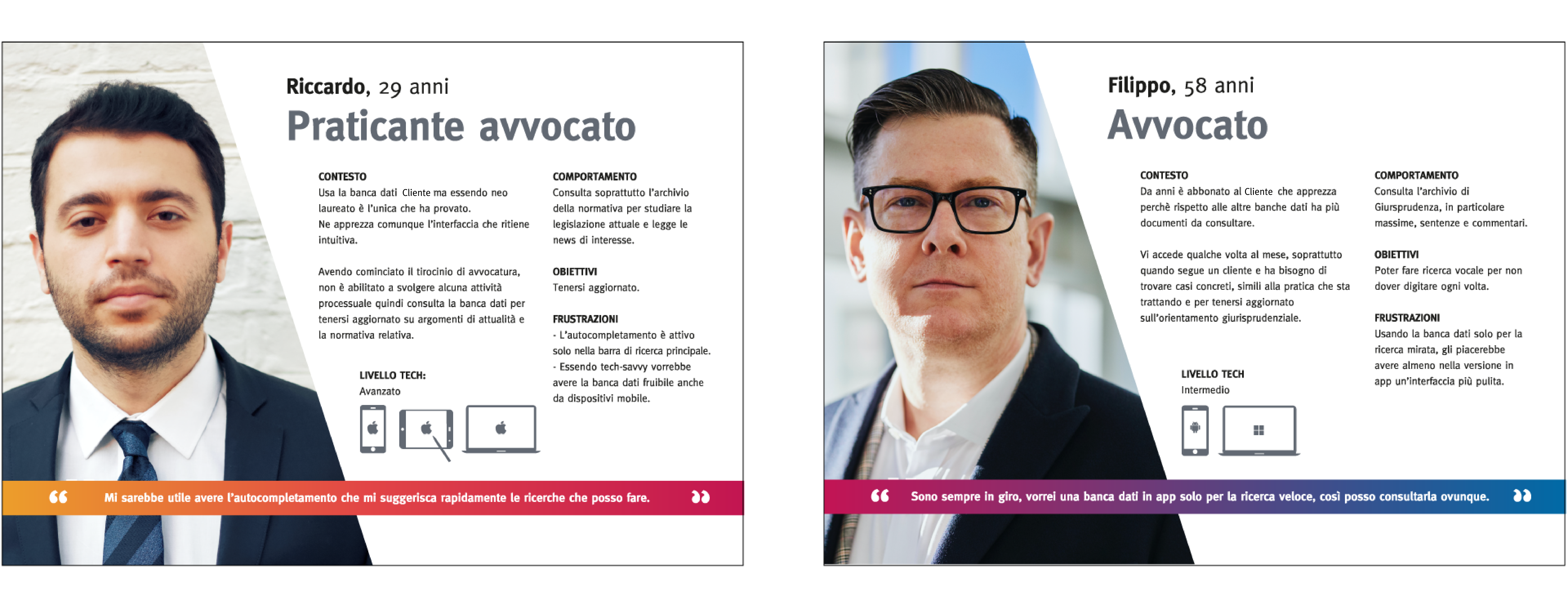
It is hypothesized that the target audience consists of two types of users:
- 18 - 29 years the law student or law trainee.
- 30 - 65 years the legal professional lawyer, notary, legal expert, consultant.
Within these two user segments, there will be 3 different levels of tech proficiency:
- Beginner
- Intermediate
- Advanced

Research Methods
To understand how users interact with an online legal database and how they consult the available documents, two types of research were conducted:
- Quantitative Research - questionnaire o collect statistical data and draw conclusions about the general behavior of users. * Multiple-choice and open-ended questionnaire.
- Qualitative Research - interviews To explore the user's experience with their database in more detail. * 3 interviews, one with a user subscribed to the client's database and two with subscribers to other databases.
The main objectives are to discover:
- Why the user chose the database he is subscribed to and why he prefers it over other options on the market.
- The context in which he primarily uses the database and which archives he consults most frequently.
- Which missing functionalities he considers crucial for optimizing search or document consultation.
* NOTE: Since current users of the client cannot be included, the questionnaire was submitted to a sample of target users: the lawyers.
SOME DATA COLLECTED
50% of users use the client's database and prefer it over competitor platforms for its more intuitive graphic interface.
100%of users mainly consult the Jurisprudence archive within their database to search for similar cases to the ones they are working on and to stay updated on the legal trends.
KEY INSIGHT
From the research, it emerged that legal professionals did not want a full mobile version of the platform but only specific functionalities, such as advanced search of documents to support efficient legal strategy.
PERSONAS AND USER JOURNEY
The research confirmed the initially hypothesized target groups. For each, a user journey was defined, which revealed critical issues that were addressed in a second user journey, designed to improve the user experience with the database.
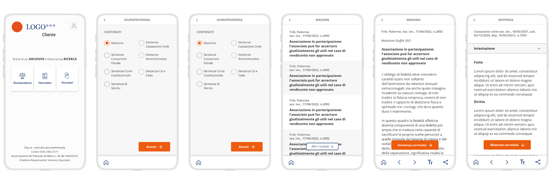
INFORMATION ARCHITECTURE
The hierarchical structure of the app with category groups and the relationship between the app's screens.

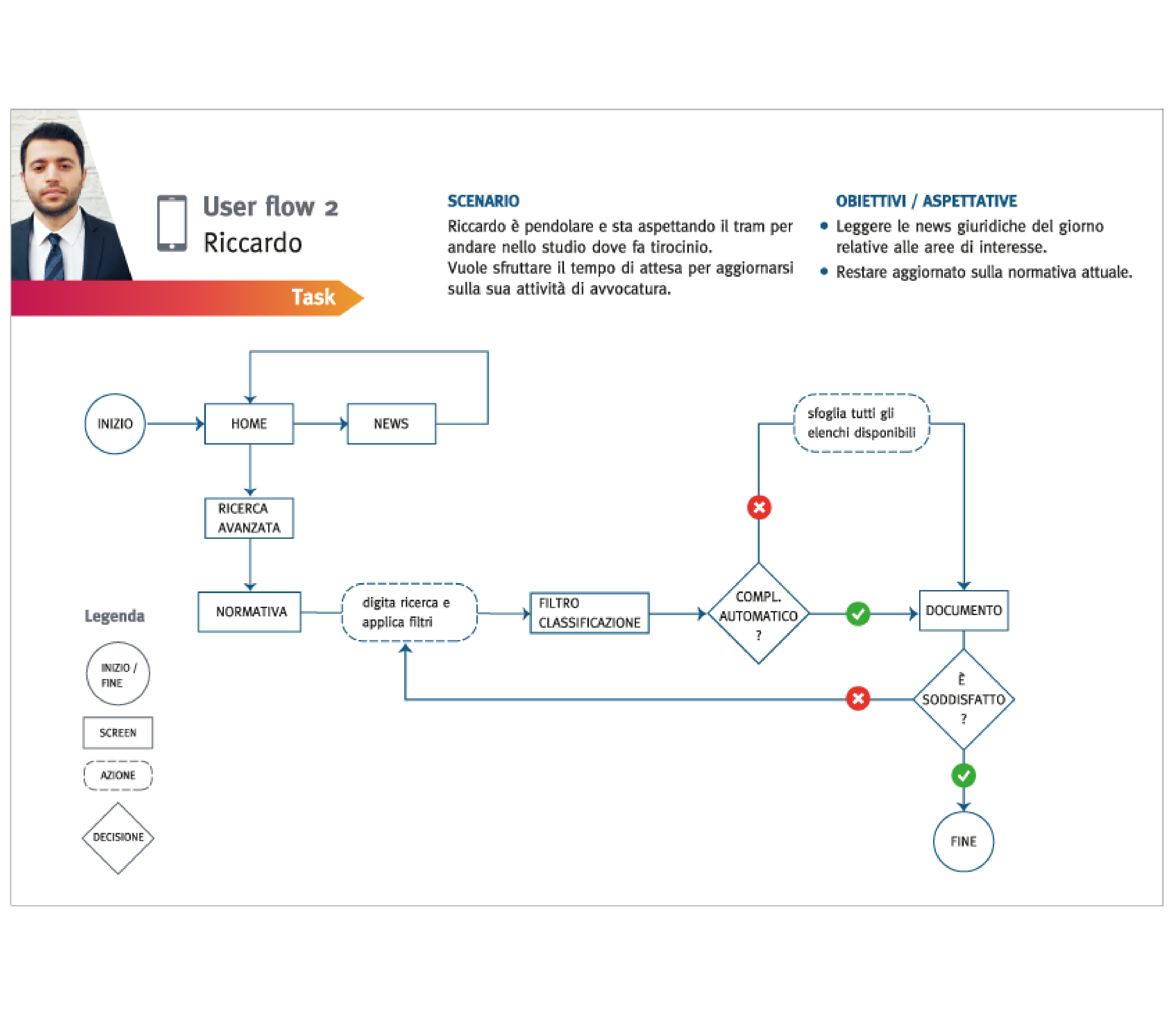
USER FLOW
The two paths taken by the two Personas within the app to achieve a specific goal have been outlined.
MID-FI WIREFRAME
Structure, content, hierarchy, functionality, and behavior of the interface.

DESIGN KIT
The app uses colors and font family of the corresponding website to ensure consistency with the brand identity.